All functionality on web pages and applications starts with markup. The previous post in this series, URLs For People Focused Mobile Communication, documented the various URL schemes for launching the communication apps shown in the mockups, as well as results of testing them on mobile devices. Those tests used minimal markup.
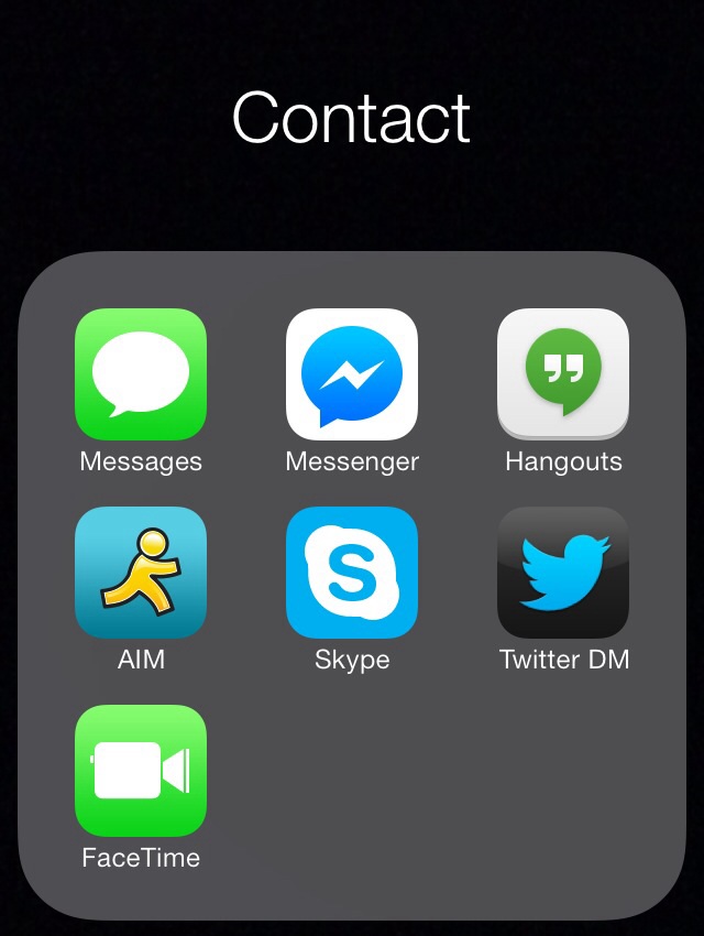
This post documents and explains that markup, building up element by element from a simple hyperlink to the structure implied by this mockup:
Or if you want, you may jump directly to the complete markup example.
A hyperlink
A hyperlink provides a way for the user to navigate to other web pages. Using a URL scheme for a communication app, a hyperlink can start a message, resume a conversation, or start an audio/video call. Here's a simple hyperlink that uses the first URL scheme documented in the previous post, sms:
<a href="sms:user@example.com">txt message</a>
Live example: txt message
Activating that live example likely won't do much, as user@example.com does not belong to anyone. Example.com is a domain registered purely for the purpose of examples like this one. To make this hyperlink work, you'd have to use a registered AppleID email address, which would send a txt on iOS, and fallback to email via phone provider on Android.
Action labels not app names
I use the link text "txt message" to indicate its user-centered function: the action of creating a txt message, from one human to another.
Contrast that with the mockup above (which I "built" using an iOS7 home screen folder), which uses the label "Messages", the name of the application it launches.
This deliberate change from "Messages" (application) to "txt message" (action) reflects the larger purpose of this exercise: people-focused rather than app-focused communication. Subsequent labels follow a similar approach.
An image hyperlink
A simple text hyperlink is functional, yet does not provide the immediate association and recognition conveyed by the Messages icon in the mockup. There are two methods of providing an image hyperlink:
- An
<img>element inside the hyperlink - A CSS
background-image
The question of when to use markup for an image and when to use CSS is usually easily answered by the question: is the image meaningful content (like a photograph) or purely decorative (like a flourish)? Or by asking, is any meaning lost if the image is dropped?
The Messages image is neither content nor decorative. It's a button, and it's also a standard iOS user interface element, which means it does convey meaning to those users, above and beyond any text label. Here's the minimum markup for an image hyperlink, with the link text moved into the alt attribute as a fallback:
<a href="sms:user@example.com">
  <img src="ios7-messages-icon.png"
       alt="txt message"/>
</a>
Live example:
![]()
Image and text hyperlink
There is a third option, as implied by the mockup, and that is to use both an image and a text label. That's a simple matter of moving the alt text outside the image:
<a href="sms:user@example.com">
  <img src="ios7-messages-icon.png"
       alt=""/>
  txt message
</a>
Live example:
![]() txt message
txt message
The alt attribute is left deliberately empty since putting anything there would not add to the usability of the link, and could in fact detract from it.
Unlike the mockup, the link text is next to (instead of underneath) the image, and is blue & underlined. These are all presentational aspects and will be addressed in the next post on CSS for People Focused Mobile Communication.
A list of communication options
The mockup also shows multiple communication buttons in a list laid out as a grid. We can assign meaning to the order of the buttons - the site owner's preferred order of communication methods. Thus we use an ordered list to convey that their order is significant. Here's a few image+text links wrapped in list items inside an ordered list:
<ol>
  <li><a href="sms:user@example.com">
      <img src="ios7-messages-icon.png"
           alt=""/>
      txt message
  </a></li>
  <li><a href="fb-messenger://user-thread/4">
      <img src="fb-messenger-icon.png"
           alt=""/>
      <abbr title="Facebook">FB</abbr> message
  </a></li>
  <li><a href="aim:goim?screenname=tantekc&message=hi">
      <img src="aim-icon.png"
           alt=""/>
      AIM chat
  </a></li>
</ol>
Note the use of an <abbr> element to abbreviate "Facebook" just to "FB" to shorten the overall "FB message" link text.
Live example:
 FB message
 AIM chat
Just as in the previous URLs post, the FB message link uses Zuck's ID, and the AIM chat link uses the same nickname I've had in the sidebar for a while.
List heading
The mockup labels the entire grid "Contact" (also deliberately chosen as an action, rather than the "Contacts" application). This makes sense as a heading, and in the context of a home page, a second level heading:
<h2>Contact</h2>
No need for a separate live example - the subheads above are all <h2> elements. As is this one:
Putting it all together
Combining the Contact heading with the previous ordered list, and adding the remaining buttons:
<h2>Contact</h2>
<ol>
  <li><a href="sms:user@example.com">
      <img src="ios7-messages-icon.png"
           alt=""/>
      txt message
  </a></li>
  <li><a href="fb-messenger://user-thread/4">
      <img src="fb-messenger-icon.png"
           alt=""/>
      <abbr title="Facebook">FB</abbr> message
  </a></li>
  <li><a href="aim:goim?screenname=tantekc&message=hi">
      <img src="aim-icon.png"
           alt=""/>
      AIM chat
  </a></li>
  <li><a href="facetime:user@example.com">
      <img src="facetime-icon.png"
           alt=""/>
      FaceTime call
  </a></li>
  <li><a href="skype:echo123?call">
      <img src="skype-icon.png"
           alt=""/>
      Skype call
  </a></li>
  <li><a href="https://mobile.twitter.com/t/messages">
      <img src="twitter-dm-icon.png"
           alt=""/>
      Twitter DM
  </a></li>
</ol>
In this final code example I've highlighted (using orange bold tags), the key pieces you need to change to your own identifiers on each service.
Live example once more, including heading:
Contact
 Skype call
I dropped the Google Hangouts icon since that application lacks support for any URL schemes (as noted in the previous post). Also I've re-ordered a bit from the mockup, having found that I prefer FaceTime over Skype. Pick your own from among the documented URL schemes, and order them to your preference.
Next Steps
All the essential structure is there, yet it clearly needs some CSS. There's plenty to fix from inconsistent image sizes (all but the Messages & FaceTime icons are from Apple's iTunes store web pages), to blue underlined link text. And there's plenty to clean up to approach the look of the mockup: from the clustered center-aligned image+text button layout, to the grid layout of the buttons, to white text on the gray rounded corner ordered list background.
That's all for the next post in this series.