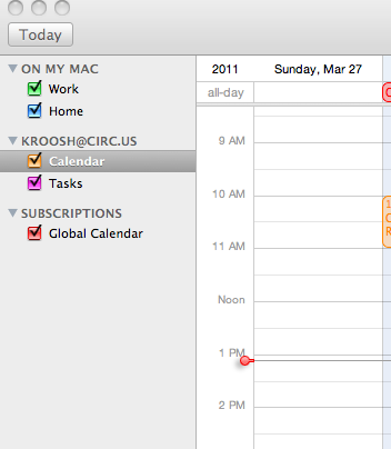
re @markng Android, @somnambulant Outlook, @kevinmarks gCal. Pictures? Thanks @devonmitton @kroosh iCal red dot:
http://yfrog.com/h0a17bp 

The iCal red dot is cool, but the grey line that extends is both too subtle (gets lost in grid line noise), and is confusing when it extends to days other than today (e.g."now" is not Sunday, Mar 27 as shown). Also, the dot looks like a clickable affordance but doesn't seem to do anything when clicked. Feels half-designed. UPDATE: see also the Android Calendar screenshots from @markng: http://ttk.me/t4B14