tantek.com

t

  1. #UX: "Learn more" Links in Warning Boxes Should Go To A Page With These Three Things

    on

    Sometimes web pages display brief warning boxes at the top with "learn more" links. The learn more link in a specific warning box should go to a page specifically about that warning with, in rough order:

    1. screenshot of warning box
    2. quoted full text of the warning (for searchability / search engine discovery)
    3. detailed text answering:
      • how could have the issue occurred?
      • what should the user do to resolve the issue?
      • how can the user avoid the issue in the future?

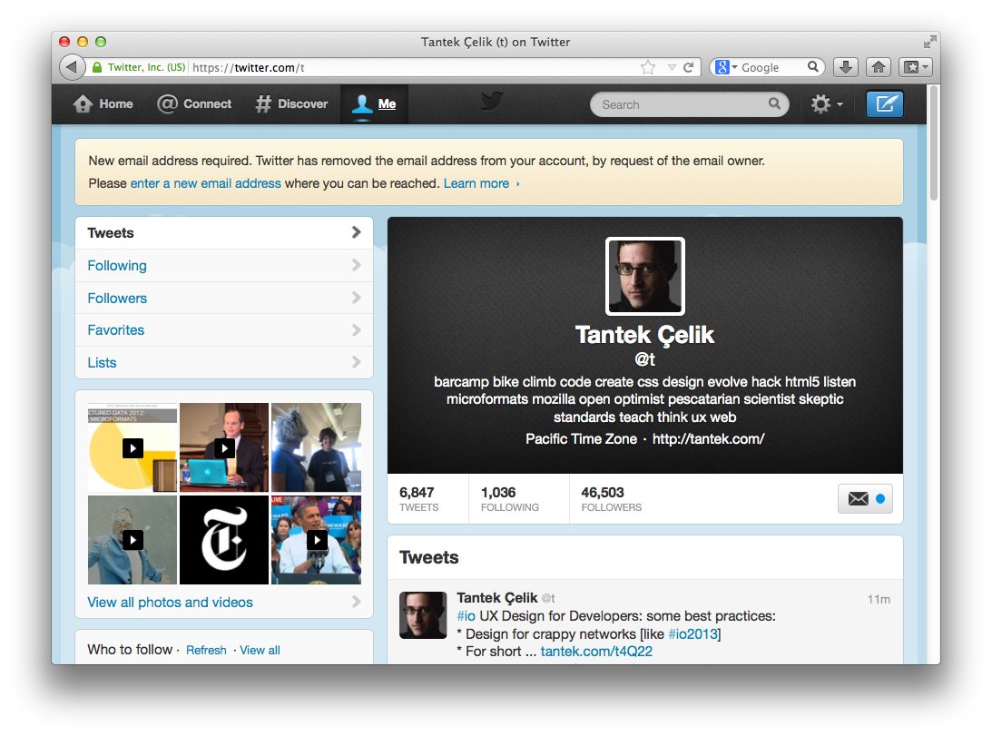
    E.g. the "Learn more ›" link in the yellow warning box in this screenshot:

    cropped screenshot of a tweet permalink page with a yellow warning box at the top

    links to: https://support.twitter.com/articles/82050-i-m-having-trouble-confirming-my-email which:

    • Neither has screenshot nor text of warning
    • Covers several topics unrelated to the warning
    • Does not answer the above questions

    And could be improved by linking to a specific page about this particular warning, containing the above points 1-3, and answering all three questions in point 3.

    Related: Scary Twitter warning: "... removed the email address from your account...

    on
  2. @rk thanks for the followups. I won't alter my Twitter account configuration. How can I help with forensics?

    on
  3. @rk have never clicked a "this is not me" link in any Twitter email; certainly not today. Double-checked gmail log too

    on
  4. Scary Twitter warning: "... removed the email address from your account, by request of the email owner" More: a png.

    Screenshot of warning box with text:

    "New email address required. Twitter has removed the email address from your account, by request of the email owner.
    Please enter a new email address where you can be reached. Learn more ›"

    The hyperlinked phrases do not make it clear how this happened, how the email address was revoked, how to avoid having it revoked in the future etc. Not a good user experience. (Update, how to improve it: tantek.com/2013/137/b1/ux-learn-more-links-warning-boxes-three-things)

    Documenting this publicly because if it's freaking me out, it's probably something that would freak other people out as well.

    Is my Twitter account being hacked? (Update: apparently not)
    Is my email being hacked?
    What (if any) passwords should I change?

    More: indiewebcamp.com/Twitter#Email_Identity_Removal

    on
  5. #io UX Design for Developers: some best practices:
    * Design for crappy networks [like #io2013]
    * For short attention spans
    * Prefetch more data
    * Cache fetched data

    Previously:
    * tantek.com/2012/073/t4/js-ajax-only-tired-waiting-bloated-scripts-sxsw-wifi
    * tantek.com/2011/239/t4/network-slowest-unreliable-untrusted-insecure-computer
    * tantek.com/2011/239/t5/slow-network-users-ajax-link-nothing-slow-like-js-off

    on
  6. #io UX Design for Developers started with #UI!=#UX common painful examples of #login and #checkout flows #io2013 #io13

    on